Saturday 28 February 2015

Brainstorm Challenges|PPP3

Brainstorm is a Facebook group created by proffesional concept artists, including John Park. As stated in a description: We focus on thinking, problem solving, story, function, purpose, and staging. Brainstorm is place of monthly design challenges that include various topics and allow use of any type of media - it can be a 2D image or a Zbrush sculpt, it doesn't matter.

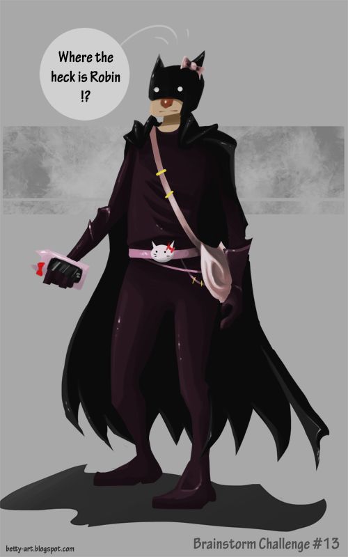
I took part in two chalenges, first one was to redesign one of the environments from studio Ghibli film - Spirited Away. Second one was more relax, as it was to redesign Batman.


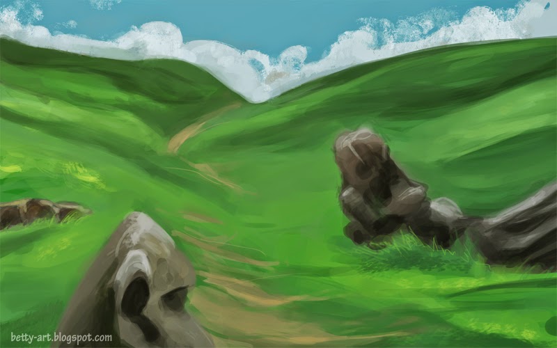
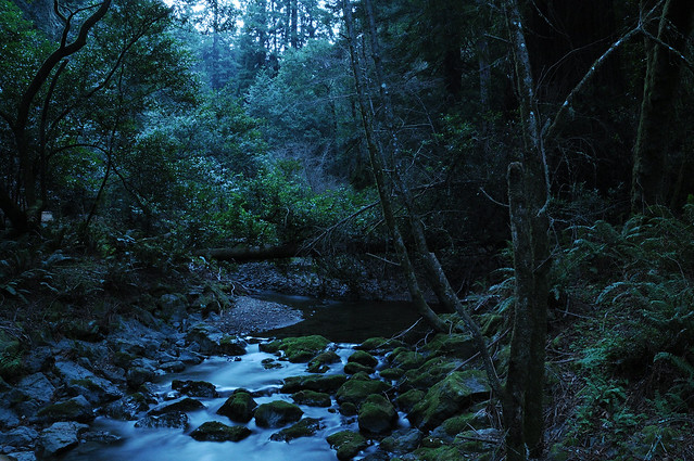
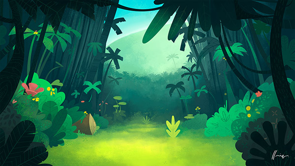
Let's be honest, I hardly ever draw any environments. They are outside of my comfort zone, and comfort zones are those cozy worry-free cocoons. However, it can get a bit boring staying all the time in a cocoon, so I've decided to challenge myself. There are many things wrong with this painting, composition is far from good, colours are a bit too saturated. Figure in front should be probably a lot darker, maybe reduced to just silhuette and moved a little bit more to the side so it will create a frame.Grassy hills should have more colours, especially the one far away - more blue tones to indicate distance. Nevertheless, I tried. And enjoyed the process while learning a lot.
Batman challenge was a chance for me to take a theme lightly and make something a bit cheerful and not serious. Many entries from this challenge had Batman presented in totaly different era and while those images where stunning, all of them had that serious vibe. Personally, I love seeing works that totally spin and twist theme and make something unique. These kind of works are usually also remembered better. I did my Batman as if he was just a growing up in Akihabara teenager, obsessed with cosplay and Hello Kitty. After adding 'Where the heck is Robin!?' I instantly thought of how Batman's trusty companion could look like. It would definately be interesting to take this idea a bit further and I might actually make it in the future.

After college I'm hoping to have a lot more time for these chalenges as they are really fun.

Costumes01|Extended Practice

Since I've stablished final look for Boy and Girl I moved to the other task, which was designing costumes. I've created few different variations for each character but feel like experimenting even more if time allows as I still got some ideas that need testing out.
Subtle colour pallete and simplicity of clothes will add to the overall stylization and help hold everything in place. I've tried to apply some of the Slavic patterns onto the clothes, but at the end abandoned that idea as they were too small and not visible.
Personally, I like Boy clothes designs a lot while I can't seem to connect with Girl. There is stil something odd about way she looks. It could be due to her body shape and facial features placed really low (also her eyes are turned down). I may revisit her design again and work a bit more, but those are small changes that won't impact overall design that much.

Monday 23 February 2015

Costume Moodboards|Extended Practice

Initially I wasn't sure if the action of my story should take place somewhere in past or not. After a bit of thinking I've decided to go with modern settings, however with the costume designs I stil wanted to look at traditional Slavic clothing.

Patterns are very important and hold multiple meanings, depanding on a style, colour and country. Traditional Slavic dresses are very decorative and beautiful. However very impractical in running across the forest.
I've created a board on Pinterested with various Slavic-themed pins. I've not only found many traditional pieces of clothing but also many modern versions incorporating patterns in their design. I feel like this research will inform my costume designs and keep me inspired.

Saturday 21 February 2015

10 tips on survivng as freelance artist|PPP3

Artstation article: tips on surviving as freelance artist - 10 tips from amazing artists from various fields. I really liked all the tips they gave, especially when it comes down to getting organised and managing workload. Also the tip about working for the company first seem to be logical, as you need to first to find out how long things can take and how much they are actually worth. However, most studios expect some sort of experience, which can be obtaining from doing freelance tasks. And I feel like that creates a bit of vicous cycle.
Also the advice on respecting clients is important, as it's benefitial to get tasks done on time and deliver quality work.
Overall it was a good article and I think I will refer to it again in the future.

Thursday 19 February 2015

Girl - initial sketches|Extended Practice

Girl was the next character on my list I've decided to work on. From my notes I knew that she should look young, have blond braided hair and small nose.
Since all the very early design work was done on Boy character I already knew the direction this should be done. After sketching second from the left concept I came to conclusion to use a similar ears and thick forearms in the next drawings. I also like the way eyes and hair were drawn in the second one. As for the main body - first and last one are my favourites. Both of them are quite girly and petite, which suits small girl. In final design I'll incorporate all these elements.

Wednesday 18 February 2015

Boy - initial sketches|Extended Practice

First character I've decided to work on was Boy. First few rows of rough concepts shows him in more cartoony and human like form, which I wasn't particulary fond of. I felt like they looked too plain and lacked charm that will gasp viewers. Also first three rows of characters doesn't look puppet-like enough. However last row shows the different direction I decided to take. As mentioned previously, I wanted to characters to be stylised in a specific way, with thick outlines and puppet-like aesthetic. Bottom row is very I took this direction. I found the one in the middle the most fitting the description of Boy and used it as a base for futher exploration.

After finding style matching my criteria I've created another 3 drawings to explore puppet idea even futher. I find first concept the most suitable, however I like the way feet are drawn on the second one and shoulder joints of the third. With this I'll create a finished character design that'll be used in animation.

Also, I decided to go with a pins and 2D look, which will force me to use a specific way of animating, which will mimic more or less movement of real paper puppets.

Tuesday 17 February 2015

Sarah Muller and Andrew Burrell|PPP3

On Thursday (12.02) we had a talk from Sarah Muller (head of CBBC drama development, animation & acquisitions) and Andrew Burrell (CBBC producer/series script editor).

Sarah Muller talked about various shows that are included in CBBC programme, such as Arthur and ScoobyDoo. She also mentions couple of things regarding new shows that are coming to CBBC. She encouraged young animators to publish their shorts on YouTube. With large number of views and subscribers, chances to be discovered by big TV station are high. Moreover, the way kids what shows this days are changing, with short, few minutes long episodes being really popular. Currently, what CBBC is looking for are more adult aimed series and a character-driven stories. Ideas have to stand out, be unique and interesting. They also would like to have a shows like Family Guy or The Simpsons, but aimed at young audience (pre-school kids).
Andrew Burrell talked about script writing for animated series. He pointed out many interesting facts about writing, how to create an interesting character and story, that'll fuel 52 episode long serie.

Overall, it was a very interesting talk and a great way to listen to the people who work in the animation industry.

Division 48|Extended Practice

Division 48 is a polish animation and concept art studio based in Wroclaw. They worked on cinematics for upcoming Witcher 3 game, Dying Light, Heroes: Might&Magic and many more. I've probably talked a bit about some of their projects already in the past, but feel like it's worth revisiting for this project. Work done by Division 48 amazing artists, such as Grzegorz Przybys and Katarzyna Niemczyk, got distinctive style that is huge inspiration for me. Lines are thick, colour pallette limited and the whole video usually has this 'motion graphic' feel to it.


Since my project is linking multiple Slavic tales together, re-cap video they've created for Witcher 3: Wild Hunt seems appropriate to look at. I like the gritty vibe it have. Similarly to their previous projects, 3D was used for many scenes. I feel like taking a lot from the way they directed camera and have continous shots. Also little details, such as raindrops falling down from character's clothes, makes it believable.

Monday 16 February 2015

Harrdy - 2D animated short|Extended Practice


Harrdy is a 2D animated short created by Henrique Lira. It presents a simple, yet funny, story of a Arr (pirate) and Howdy (lumberjack). Characters and backgrounds are very colourful, stylized and definately appealing to kids. What cought my eye was not only the style, but the fact that Henrique used AfterEffects to put is all together (Photoshop and Illustrator were also used). Only 3 background paintings were used, however it doesn't affect the way story is presented - actually it works really well! On the other hand, characters were sliced into numbreous small parts used for animation. As stated on Behance, lumberjack was made of 40 different layers, while pirate - 50. 
Since I want to create my final piece in AfterEffects I'l need to keep an eye on how characters are constructed and the way I can effectively animate them. Puppet tool'll definately come in handy!

Puppet Moodboard|Extended Practice

After searching Behance for puppet related projects I moved to Pinterest asnd created a board where I've gathered images of various paper puppets.
I like the simple style of the puppets and joints connected with pins that enable some movement. There is also room for testing out different styles and approaches and I'm still usure wherever I should have visible pins or not?

Saturday 14 February 2015

Paper dolls and puppets|Extended Practice

With this brief I wanted to create something a little bit darker than my usual, colourful, happy characters. In my opinion puppets and paper dolls have this unique feel, that makes them still very appealing to kids, but in the same time leaves a lot of room for experimenting. When taking from Slavic tales as main source of inspiration, puppets seemed to be appropriate. There is something unique in terms of style about old animations (such as Wodnik Szuwarek) made in 70s and 80s. In attempt to recreate that vibe I've looked at various examples of puppets and paper dolls projects on Behance.

Puppet Making Portfolio is a project full of plasticine puppets made in specific style that can be appealing to some (and can be a bit creepy and disturbing to others). I especially like Goddess Venus puppet that was made with foam, liquid latex, resin, fabric and felting wool. There is something interesting about her face, such as big eyes and red nose that draws my attention (and makes me think it's suitable for this project).

Harap-Alb DIY paper puppet figures is another 3D project that cought my eye. I like the simplicity of the characters and use of basic shapes that were used to build them.

Kamikugutsu is a series of paper doll illustrations painted with acrilics by Watanabe Mayumi. Again, there is something magical and disturbing about them, faces are well painted and detailed. Proportions are a little bit off, you can tell there are many things wrong, but in a same time, they're not distorted completly.

Last project I've decided to include is Paper dolls. It features many paper doll with pin joints to enable movement. I found idea of having visible pins interesting.

Thursday 12 February 2015

Searching for style01|Extended Practice

As I'm still working on script I've decided to play a little bit longer with traditional tools. Again, my main weapon of choice were markers and fineliners.

Fineliners enable me to test different line thicknesses and are mess-free :). Colouring with markers is fast, can fill large parts of drawing and, opposite to paints, doesn't need to dry.
Above, I've tried another two design itterations for Vodyanoy character. I'm stil not happy with it and feel like it can be pushed much more futher along with more design explorations. As for the boy character - I used it as test for a puppet-like look. What I'll probably take from it is the texture of a skin that imitates wood or paper, big eyes and shape of mouth.
Below are quick tree concepts. Again I tried different shapes, which were heavily inspired by the style of the Don't Starve game. Colour-wise they seem to be too happy and cartoony for me. I'll have to explore that futher in Photoshop. As for shapes - red and blue-ish green 'fluffy' trees are my favourite and I feel like using this design iteration in later process.

Wednesday 11 February 2015

Valiant Hearts|Extended Practice

Valiant Hearts: The Great War is a puzzle adventure game developed by Ubisoft Montpellier and published by Ubisoft, released on many platforms, including XboxOne and Playstation4. It 's powered by UbiArt Framework engine, which was previously used in Rayman: Origins, R: Legends and Child Of Light. All of these games share the similar aesthetic, extreme attention to detail and stunning artwork.

Valiant Hearts is a lot darker than Rayman games, as it takes place after 1914 and ends in 1917 (World War I timeline). Story itself is very interesting and features many interesting characters. Subject of war has been done many times already in games - usually stories are based on ancient wars that took place ages ago and don't tackle more modern history. First World War in a way is unpopular among developers.

The art style of this title is quite unique and very interesting. Under the simple aesthetics lie complex stories, world is rich, beatifully painted and detailed. This game uses art to convey emotions. I feel like this particular title will hugely inspire work I do for this module.
Subject matter of Valiant Hearts is different to what I'm working on, same goes to the more mature audience. However, the way characters and backgrounds are drawn, with it dark and grim style, makes me think it could appeal to the kids too.
Valiant Hearts: Developers Diary - Art& Emotions - insight into make-of the game and thinking process behind it.

Colour|Extended Practice

While writing my dissertation for COP3 module I became interested in colour theory. Back then I look at certain tones and meanings connected to them, which helped me better present my characters. This time however I looked at colour wheel for different reason.

Action of the animated video is going to take place during night, deep in a forest. Therefore colours have to be muted, subtle shades of blues, greens and browns will take big chunk of the used pallette. I tend to go for bright, vibrant hues but with this project I've to avoid those. Afterall everything has to make sense. I'll be creating my assets and backgrounds separately so I need a constant reminder of when the action takes place. However, there is room for experimentation, as the animation style is going to mimic puppet theatre. I just can't go over the board with bright and cheerful colours.

As for the meaning: blue is known for it's calming effect and it's a colour of trust, loyalty and honesty. It's also a safe colour, as many people tend to like it. Brown on the other side, signify stability, structure and support.

For the puppets I feel like going for grey-ish tones, backgrounds will also has to be subtle to create a sense of depth and keep everything together. Moreover, I'l try to keep outline of my pupets thick and chunky to make them stand out.

Monday 9 February 2015

Kupala Night and fern flower|Extended Practice

Kupala Night takes place during Summer Soltice, when nights are short (and that related to many Pagan rituals). Kupala Night is celebrated in many Eastern Europe countries, like Russia, Ukraine, Belarus and Poland on 23/24 of June (Julian calendar). It's an opposite celebration to Koliada- a winter holiday. 
As for rituals - along with the myth of the fern flower (according to tales it only blooms during that night), young people are also testing their bravery and faith by jumping over flames of bonfire. If a couple, who is in love, fails to complete jump while holding hands, is at the risk of separation. Girl also might make wreaths from flowers and float them on the river to see how their future relationships will work.


There are also stories that happens during that time. For example, Kasia Gazdowna released a Kupala comic recently. St. John's Eve by Nikolai Gogol is a short story from Evenings on a Farm Near Dikanka. Also fern flower appears in one of the J.I. Kraszewski fairy tales - Kwiat Paproci is a tale about fight between good and bad.

As for the fern flower - it's a mythical plant that appears in Slavic mytholodgy. According to tales, fern flower is yellow but changes its colour to red during Kupala Night. It's also worth noting that ferns are not flowering plants. Nevertheless the origins of the tale can be explain as some of the fern-like plants produce sporangia in tight clusters which looks like flowers.