Sunday 21 December 2014

Riot Art Contest 2014|PPP3

 In October The Riot Games in parternship with polycount.com launched a art contest aimed at ilustrators, animators, texturesrs, modellers and VFX artists. 5 different categories brought great opportunity for many creatives to enter. I've picked a character category in which your task was to pick a champion and design a splash screen illustration.
Challenge, oh challenge. I've to come up with a dynamic pose. And there has to be background.
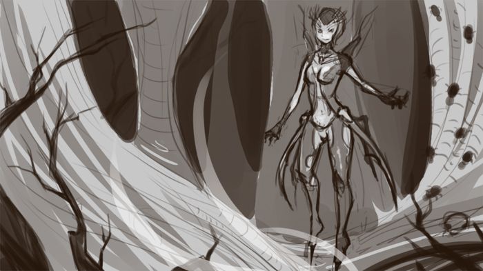
I've pick Elise, since I really like her outfit and drawing spider den sounded like a good idea. It should be noted, that skins created for champions where welcomed (skins are designs created by community not by Riot artists). I tried to capture her looking powerful and frightening. Suggestion I got on my forum thread was to add more spiders on the left.
Unfortunately I haven't manage to finish this piece on time, but hopefully one day I'll get back to it.

Thursday 11 December 2014

Rationale|Extended Practice

First task we were asked to complete for the Extended Practice module was to fill a pro-forma for Rationale. As the work done for this module will be displayed for a week as a part of Final Year Show I wanted to create something that will be easy to digest and in the same time interesting (and good enough to include in portfolio).

Since I'm very interested in concept art and illustration I wanted to somehow incorporate it with the knowledge of AfterEffects I got already from previous modules. My aim is to create a up to 2 minutes long video with the illustrations created specificaly for this brief. I'll use AE (3D layers, puppet tool) to create a parallax effect and a sense of 2.5D space.

Examples of what I want to achive:
  • https://www.behance.net/gallery/1498997/Adventure-Concept-Art
  • https://www.behance.net/gallery/5885617/Aliens
  • https://www.behance.net/gallery/10633661/Might-and-Magic-X-Legacy-Intro
  • https://www.behance.net/gallery/2651627/Kosmostumostow
Since I want to have a some sort of storyline that will tie up all the illustrations together, I'l be looking into different myths and folktales as a source of inspiration, however at this stage I'm not sure if the final piece will be more fantasy or sci-fi orientated.

In terms of art style I'm still debating wherever final piece should be semi-realistic or more cartoon-y, will do some tests one have a general story idea and decide on the one that works best. Personally, at this point, I lean towards more cartoon-y approach, mostly because I've been doing a lot semi-realistic character concepts lately. It also would be more challenging and a great opportunity to learn something new.

Sound - free sound libraries that are available online, but considering possible collaboration with the composer or having a voice-over.

In terms of resources I'll be looking at ImagineFX magazine (art related tips and inspiration), Framed Ink (composition and framing shots), various websites and livestreams, such as LevelUp!, FZDCinema, Sycra's YT channel, ctr+paint (great tips from Matt Kohr).

Friday 5 December 2014

Visiting Speaker - James Wall|PPP3

Today I've attended a talk by James Wall - filmmaker and past gradute of Leeds College of Art. He talked mostly about the process of making The Truth About Romance, his first feature film that has almost milion views on YouTube. Film was made with almost zero budget and home made equipment (like track and dolly), shot in two weeks by extremly small crew and it took a year for James to do post production. His story was very inspirational and interesting. He also talked about the life as a freelancer and daily commutes to Manchester (as Leeds doesn't have many work opportunities). Similarly to many other people, he said that networking is very important and helpful with getting jobs, which is something I'm going to work a lot more in upcoming months.

Wednesday 3 December 2014

Academic Poster - Crit|COP3

Today we had a crit day for the Academic Poster task. Work (printed A3 size) was put on the wall along with the blank sheets of paper for people to write feedback on.

 On the left is the initial first draft of the poster. I wasn't quite happy with the spacing but couldn't really figure out how to improve it at this point. Feedback I got was mostly about the layout, text placement and font. I went back to the Photoshop (really I need to learn InDesign) and tweaked few things. First thing I did was to change the font type for the body text and made sure it's spaced evenly. I moved it a little bit around and tried to make all the sections equal, but also left a bit more room for the results. Previously I felt like outcomes were a bit squashed and was glad to get extra space for the artwork.
Looking at this version after few hours I feel like adding a logo to fill the blank square space on right hand side as well as aligning text a bit better (middle column seem to be a bit lower). 

Tuesday 2 December 2014

Female Warrior Analysis|COP3

I've used my female warrior concept as a perfect excuse to ask people around me for valuable feedback. Following advice (and critique) was given to me by Sanda Duchiewicz. She's not only very interested in fantasy, but also worked on titles such Rome: Total War, which require strong understanding amour that is historically accurate.

After I shown her my female warrior concept, this is the feedback I got:
  • work a bit more one the face, since nose is shaded but eyes seems to be left out;
  • shoulder pad is only on one side, which gives protection only from one side; since she doesn't have shield, but two swords, it makes her right side a very easy target;
  • spikes on the shoulder pad are very big, which probably adds extra, unnecessary weight to the pad and makes arm movements more difficult and tiring;
  • shoes are drawn in a way that indicates heels, so I've added chunky heels to the drawing;
  • really good reference for shoulder pad and spikes (can see the relation of the size between pads and spikes).
Some of those things are pretty obvious, but as a person unexperience with creation of fantasy concept art, most of it didn't really crossed my mind. Therefore chatting with someone from the industry was very valuable for me.

On the left is a piece of concept I did after the chat we had. I've gave her two shoulder pads for better protection and some more fabric that will separate skin from the steel. I've also changed her outfit a little bit. With the outer layer of clothing I tried to imitate leather, which is more durable than soft fabrics (such as cotton). I also changed belts to better match her outfit and added heels to the shoes.
It is still a pretty unpractical and historically inaccurate armour, but a bit closer to something that would make sense on the battlefield. As said before, I'm not trying to make armour that could be used in a real battle, I'm deeply inspired by fantasy games, however, it's good to know and understand how the things works. I feel like my understanding of this topic is improving with every piece.